                                                   ::=++-
                                                  +%%#*+=.              .::-=%+*-
                                               :-+=:-++=::+=-:    :. :*@@@@@@@@*+:
                                          ..-+****+-       +%@@*: :.+%@@@@@@##%##*  :-.   ..
                                       ...:+*##%%%@@@@*=+***#%%@@%#@@@%#+#@@@@@@@@=:-=++==+*+.
                                     .. .+#%###%%%%%#%@@@@@@@@@@@@@@@@@@#**%#= -#@@@@##***+  =.=+
                                    :..*#%###%%%%@@@@%@@@@@@@@@@@@@@@@*@+   :*=   -@@***+##-=#%+@-:
                                   :.=#####%%%%%@@@@@@@@@@@@@@@@@@@@@@=.=@@::-:-=  -*%@@@@#@@@#:-+
                                  ++*#####%%%%@@@@@@@@@@@@@@@@@@#@.#@@#@@@@@=+++##%***###%+.=@@+*++=
                                 -***###%%%%@@@@@@@@@@@@@@@@@@@@@@#@@#=@%#%@@==-:=@@@@@@#-%=*+. -+##=*=
                               .=#+*###%%%%@@@@@@@@@@@@@@@@@@@@@@@@@@@%@%%%*##=-::.=#%@%*+#@*%@= :.=%%%*-.
                               .+#**##%%%%@@@@@@@@@@@@@@%#+++++#%*#@@@@@@@@@@@@@@@*@@@@*@@@@@%@@+%%*%%#**=::...
                  ..    .     .==*###%%%%@@@@@@@@@%#+=--:--:-::*=-%@@@@@@@@@@*#%@@@@@@@%@@@@@%@@@#%%%@%%+.-:.:::
                 ...::--+==+++**=*###%%@@@@@@@@@%++=-=---:----=#:%@%%@@%@@@@*=%@@@@@@@@%@@@@@@@@@@@%##%@@: = .:=-
                 ...... .-*++**####%%%%@@@@@@@%*+++==------:-:-*:@%%#%@%%%@@@@%@@@@@@@@@@@@@@@@@@@@@%@@%@@#*  =*-
                           +***###%%%%%@@@@@@%*+++===--::--:--=*-@@####%##%%%%@@@@@@@@%*#@@@@@@@@@@%#**##**#+**#=
                            #*###%%%%@@@@@@@##**+==-:::::::::::+=*@%####%%#%@@@%%%@@@%%@#@@@@@@@@@@@@%*+-...=+:.+
                ....       .####%%%%@@@@@@@@#**+==----:::::::::-=+@@%%######@######@@@@@@@@@@@@@@@@@@@@@@@%%@**-+.
                ........  .%####%%%@@@@@@@@@##*+===--:::::.::::::-*@@@%%%%%%%%##%%+#@@@@@@@@@@@@@@@@@@@@%@@#*:-%#*
              ....  ...-::#####%%%%@@@@@@@@@%#+===--::::.....:....:=@@@@@@%%######*#%@@@@@@@@@@@@@@@@@@@@@@*#- *#*:
               ......::-=++###%%%%@@@@@@@@@@@+===-:::........::::::::*####*##**##*###%@@@@@@@@@@@@@@@@@@@@@%@+ +%--
              .. .:::- :+**###%%%@@@@@@@@@@@+=+======--..     ........-------=++++*#%@@@@@@@@@@@@@@@@@@@@@@@##:#%-+.
               ....::---+#+##%%%%@@@@@@@@@@**@%@@@@@@@@@@#+-            ...:-=+*##@@@@@@@@@@@@@@@@@@@@@@@@@@@@%*
           ..     ::----#+-%#%%%@@@@@@@@@@%@@%++*****++***%@@*-:..     ....:=*#%%@@@@@@@@@@@@@@@@@@@@@@@@@@@@@#++-
            .  :  :---==:+#%%%%%@@@@@@@@@@@#++==++*###%%%%%%%@%+-::...:-----+#%@@@##@@@@@@@@@@@@@@@@@@@@@@@@@@%%*
           ...  ::..=++**#%#%%%@@@@@@@@@@#+-==---::::-==*###*+*@#:    ..::==#@@%***#**#****#%@@@@@@%@@@@@@@@%@@=-:    :-
            .:  ==-.:+**#%#%%%%@@@@@:::+%+:......:::---:----====*##*======@%%%+-====++***+===*#@@@@@%@@@@@@@@@#:*=.=-.@*
           . .::--++++**+-#%%%@@@@@@%%@%%+=======---=+*#@#*++===:+@=...-=#@%#*++++=-:-*+#%%@#++*%@@@@@*++*@@@@@@%*=*##+
             .  : .++**#+*%%%%@@@@@@@@@@#++*#%%%%@@@%@@@%@@#*=-:.+%:   .:*@@%###*%@%#*####%@@%###@@@@@*%*#@@@@@@@@**+:
         .  ..:.. -++==*#%#%%%@@@@@@@@##--+*#@@@%=@@@@@*-%**-::+##%-.:..-+%@=***%#.*@@@@@@@@@@%##@@@@@#@@@@@@@%#**=*%@@@@%#*+=--:..
           ... -.=*++--*##%%%%@@@@@@@@-%=-++*##**=+***#%%#+===-=-#*:::...=%@=%%%%#=+%@@@%#@@@@@@#%@@@%%@@@@@@@@@%%*+:..:.:.:--:::::...
          . ..  =+-+**+###%%%%@@@@@@@#.:%=.:::-=+**+**#**++==-  *%::..::.=%@@####%%%####%%%@%%%@%%@@@*@@@@@@@@@@%##+.=.
                -: .=*####%%%%@@@@@@@--::#=.::::::.:.....::.  -%#::::::::+#@@@*====++***#*****+*##%@#@@@@@@@@#=##%=- *....:....::....
                . :-::+%##%%%@@@@@@@#:-:..+*. ...........   :#%-.:-:::.:-=*%%%%#+-===-==+++++++****#@@@@@@@@= .:#@=- = ... ..  ::..
               . :-.-:.#@%%%%@@@@@@@=:::.. .+=-:..        -##=.:--:::...:=+*%%#*%#=-----==-----=+###*@@@@@@@    %@=-.=  :+--.  :-
              . .-------=@%%%@@@@@@@=--:...  .-=****###*##+:.:-=-::::::::=*##@@%==##**+====+++*+***#%@@%%@@@.   @@=-.#++==--:...:
              . .-: :==- .@%%@@@@@@@*--::...      ......   :=-:-:::.    :-+#%%#%%=:-+*####**++++=+###@@##@@#    @@=:.*===------:.
            .-. .--::-=- .@%%%%*@@@=*=-::..... . ..     :===-.   .:.    :-+###+*@@+::::--====-=+*+*##@@%#@@    .@@=:.*===-=+==- .
         ...:-: .-:---+- :@%%@*--+**:#---:.:...........=+-.:==+@@*+=:::::=#%@@##@%#=::--========**##%@@%#@-    .@@=::*===-++=-=
        .    :: .-.:--+- :@%%@#-+  -:==---:.....::...:++....:+##*+=+*#++#@@@@@@@%***=:-:-===++++**##@@@%@@     :@%=.:*=+==+= --   .. .
           : :: .-----+: -@%%@@--+.::-+--:::....:...-**:.::---:..::-+*#%%%##%####***#=:---=++++**##%@#%@@=     :@%+.-*+---=+-:
            .. .::-=--+: =@%%%@@--:: =*----:......=##+:---====--::-==-----=+*#########+::-==+++*###@@%@@@@:... -@%+.-*+: ::.+-  .
           .. .::-: --+. *@%%@%@+ ..:@@==+-:::::-%@+-:-=--=---:::.-+===----=++***#####%%*--=++*####@@@@*=*-#   -@%+.=*+::-  ==-:.
      .....  .:.:-  --+. *@%%@#+@%=%@@@#-+=::--=@%-----:.......::..::::--===+++++****###@%=+=*##%#@@%%@%%@*@.  =@#+.=*+===.:=-..:
    ........::---==++=*. #@%%@* *@%@@@@@+=+-:::#%:=****+--=+********++*%###%#######%%@%*%@-==+###%@@%@@@@@@@@: +@#+.+*++==-.:  -:.  ...
                      .  #%%%@@#@@@@@@@@@+#+::-+-=#+==*@@@@@+*==***#%@%%#@##@@@@@@@@%#*+#*:-+*#%#@@@@@@@@#%::- +@#+ +*+=*#=- .=. ..:. ....
..........::.............@@@%@+.%@@@@@@@@@**-:-:.:-:.:::=#@@*#:.-   :-   *++@@@@@%*+*#***:-=*#%%@@@@@@@@@%:    *@#+ **+. :==-+-   -.  .:..
::::::::-------====++**##*+*%@. #@@@@@@@@@%%%-::::::::::.:=++*###%@#%@@@@@@@%%%##**###*+-=**#%@@@@@@@*-+%*.    *@#* **++-:===:  ----.:-.:: .
---===========++++++*******#@@: #@@@@@@@@@@@@%-:-::-:::-:::-=-==:==-=+-+++*#####**##%*=*+*##%@@@@@@@%=*#       #@** %***##*=..-==:.+=.::-- .
-======++++++****###%%%@@@@@@+  .@@*+###@%@@@@@-.:::--:::-:::--=---:--:+*#*##****#%%*++%#@%@@@@@%%@@@*+        %@**.@@@%%%##***++++-::-=-=.:
                            .    #-       .@@@@@%**=:-------------=+++***+++***#####*#%%@@@@@@%@@@@@@          %@** -=====++++=++++=+*+++*::
                                 :.  .-.  .@@@@@@%#+.:------=--====+++++++**#####%*+#@@@@@@@@*@*%@#:           @@+++---:::::::........ ... -
      .:                    .      ..:     @@#@@@@@#+---::::---====+*#*******#***#*#@@@@@@@@@                  @@@@@@@@@@@@@@@@%%%%%##****+=
-:.. =*-:              :..:...-            *@#+%@@@%%#++-=-:::::--======+==+**=+*#@@@@@@@@@@@@      .          *@%@@@@@@@@@@@@@@@@@@@@@@@@@#
-   :@#*%-  @-       :.       .            :@@**@@@@@@#-+**=:--:::..:::-=+++++*%%@@@@@@@@@@@@@*:             .            .......::::::::::-
==#==*%%@=  -@:         .-.:+**+:           :@@#+%@@@@@%%@%#*----:.::--:-++**%%@@@@@@@@@@@@@@#+=+-::              ....::..:::::::......... .
:.#+=:+.    ::. .....::   --:=+=-.           +@@#*@%@@@@@@@@#*=--=+:::::-=-#%@@@@@@@@@@@@@@@@*+-+*#*=.                      ...:::--::::::::
       :            .. .=::--=*=-             @@@%##**@@@@@@@%*+===++#+*+++%@@@@@@@@@@@@@@@@@+-:=#=  .:-                            -:::::::
                     :: .--:.:*#:              #@@%**=-#@@@@@@@%@%*++*#%#@@@@@@@@@@@@@@@@@@@#-:=..*. - ..                            ---::::
.                     :..:==  -#:               +@@%*%+-+@@@@@@@@@@@@@@@@@@@@@@@@@@@@@@@@@%**--+: =*+=-:                               ..--:
. .                    .:--=-..*=                 @@@%%*++#@@@@@@@@@@@@@@@@@@@@@@@@@@@@@@@*++::++:**+++=.                              :  ::
=: ::                      .=====                  -@@#**+++#@@@%%%@@@@@@@@@@@@%%#%%@@@@@+==-:.=- :#*++=-
-+-:-=                        :=+:.                  %@@*+++=+*#%%%@@@@@%#*%%##**##%@@@@+-=--:.-:   =#+++                             .
  **=--:                        =*=:.                 #@@*+++==--====++++++*+++++#%@@#==--:=-  -*-:  -#++.                        -+. .
   =+=-:.      ::                =+=-.                 #@@%**+===--------=====+*#%%+--+=..-= -#.#*=-. -*+-                       :#:
    =*=-:.      .=:.              -+:.                 :%%#********+++++++++=---.  .=++. :=:  @-*+=-:. +*=                       *+:-::=
     =+=-:.       --:              :-.                  :#*=::....::....         .:-:...:-. .  %*+==-: :++                       %   .:.
      =+=-:.      .--:..            ::                 + :%*+=:.                     :-.:...:  **==-::  ++.                      *    .    .
       -++-:       .--:..            -.               *@  #*=--...                  . :. .. .  *#==-::  =+-          :          :=   :-   -:
       .-=+:        .::....           .               +@  *%*+=-:.                  = . ...    **==-:.  :+-.        +:          -: #=#*  :-
        .:++:        ::::...                             .-#*====-:.               +.     ..   #*=-::    =-:       =+           -: *+@. .+
          :-=:       :::::..                             --**+==---.              :. ...   .  :#*=-.     --.       *            -: *#-  +:
.          :-=:      .::::...                          ..::**++=--:.                 ..=:   .-##+=:.     .:       -+            :: @@  =-
.           :-=.      .:::::..                       . ..-*%*+==-:.                ... .=.    -*=-:       :.      =-            -+ @+ ..
.            .--       :::::::.                        .=+.:#+=-::.               ..  . :=    *+=-:.      ..      +:            := @: .
. .            ::     .::::::::                      .. . .  *+=-:.    .         ..   --==-.+%*=-:.               +.            .*.=. :.
  ..            :      .::::::-                       :*  .  #*+=-.   .        .    -%@%%#**+-::..                +:            .#:--::
.                       ..::::::                       +-   -@*==:.  ..       .   -%@#+==-::.:..                  =:.            #---:.
.                         .:.::-.                       #    *%=-:....        . .#@#+=--::......                  : .            #--=.
.                         . .::::                       :-    =#+-:::          -@*==--:::.  ..:.                  . ..           #=--
.                           ..::::.                      =- .   *+:-:.        .**-=--:..:    ..                      ..          #=--:-.
:                             .::::                       #      +*-::...    .-+=--:.....     .                                  #=-=*:  ...
:                              .:::..                     .#      +#*=:-:    ==+--:. . ..     .                 .                #=-%= .:...
-::       .=                   .:::::.                     -%       +#*=.   -=-=--:                             :               .#=+% :.....
-::.       :.                   .::.:..                     ==       .==-. :-----:.                           .::               .-=++-:...
GovCIO
Websites for GovCIO and GovCIO Media & Research · Director of UX & Strategy
2020–2025
For Elegant Seagulls
Two sites for GovCIO: the company site, and Media & Research, a news source for federal technology leaders with years of articles, podcasts, events and eBooks behind it.
- Website visitors
- +322%
- Pages per visit
- +100%

 : :::-::-=-.:.                                                     ..:-::-=:-:.:
 ::--=====:--::                                                  . -::--=-+=-++:.:..
.:--++++++=++--:: .                          .                  ..::-==+**+*+=++-=. :.                     . .
:-=*+**+#++*+=-:::                       .                    ..:::==+=+*##**#++-==-..:                . . .    .
-++=+*%#*###*=+=--::. .             . . :.:. :..               .:::=-**+##%***#+#===:-: .           .  .:. :::::. .
-==#**%@%@%#%#+*+=:--..             ::-..-:..-:  ..             :-=+*+*#**#%#@%%#+++-=.::         ....:-.::-..:.:. .
+*=+%*##%%@@%%*#+*==--  . .        .--.-::-:--..:             ...--+++**#@##%@%**#+=-+-=-. :.:.  .:.:..-==-=:-:.::
-=**##%#@@#@##%***++:-. ...     ...:.-.-:--::.. . .            : .===#*%##@####*#+**++-:=---:.  .. -:.-:==--=::-.:::
-+=++*%@%#%#%**#**+==:::.. .... ..:.:.--.=:--..: ..           ...:-:+++****###*#*+**==+-:.-::.:.: :::-:--=:--=--:: .
=-=++**###%#%%%++=-=:.::..   .  ..:::::-:--:-:::                 ::.++==+#%%##**#**+===-::..:. : :::--.=-===:-:::...
:-++=+**#+*###+*++---:. ...    ... :-:-::.:.::.                   ..-=+*++*##+***+--+=-::.......  . ...::-----:::..
. .-=+++#**+*+++==-:..   .     .... .:...:::...                     :.---==*=+==+=-==-:-       .  .: --:-:--:::
  .-.:--===+-=-=:..:..            ..    ...                          . :=::--+-==:=:.. :            .   ..:::.
  . .:::-:::::-=...                    .  .                            .:---:=..:..   .              ... ...:...
      ..:::-...:.                                                        .::..:.:                       .  :  .
         ..::..:. .                                                        .: . ..                  .    : :.
         :   ::                                                            .    .                        .:
       . .:.. ..                     ..   .                                 . .                       .  :
         .. .  .                     ..:   .                               .                         ..::::-:. .
        . . :...                  :  :.:-.  ..                                                    . ......::::
         : .:  .               .  .:.-:.-=.::.                             . .                    .:::.:=--:=::.:
      ...:.:..: :. .          :..:-=:-==---==-..                            :::                  .:-==-====+-=----:.
      ...:.-:...- :    .   ....-::-+-++*++*+===..:                     ..  : .:. . .           :::----+=+#++***+=-::  .
   . .-.-::=-=-:.-:...   :..:--:-=-+=***###++=+=:..                     :-.:-.-.: :.         :..:::-+==#*%*####*++-=-.
  . ...::::=:-===-:.:.:.. ..-.:-==*##*%##**++*++=-:: .                ..::::-=.:-:.:..:  .   ::::-=-=+++*#%%#%*+##++--::
    ...:-==-:==:--.: .:.. :.:::==+*#%%%%#%*%#**+++=::                ...::---::--.:.. ..  ... .:-:=*++*%%#%%#%#*%#*+-+:.
  . -.-::=-:=---.-:..:.::::::=-:=*=##*%%%@%%#%##*-+--:: .           ..-.:-:---::-::.. :     .:::::+=*#**####%%%#*%+*+=-:
.  .::::=-::-:.::-:  .  .  ..--+-*++*%#@%%#@#%*+*+---::..           :::.-.-:.--:-::         .. ..:-=**+*#%%@@@##%#**++--
  . ..:.::::-:-: .. .     ...::-:-++#**%#@##%##+=--:::..           ...:.:.-.:::.: :.         .. :-:-++=*%%***@*#*#**=--:
   ...  : -::.                ::=-=-+*++**#*%+*==-=::...            . . ::..::.                 .:.:===++#*%#####*===:-.
       .   ..                   .---===++*#+#+*==-:-:                . .. .                         -:===+++*#**++--:--.
         .                       . --=-++*=*+*=-=::..                                               ..-:-=+=++++*==-=- .
                                   ..-:-==+-+----:. .                                                  :.:--++-=:-::.
                                   . :---:=-=:--. .                                                   . ..---::=-.-::
                                      ..--=---:-. .                                                      ..-::-:-.::.
                                       ::::.::-::  .                                                       :::::..
                                      .::..:-.. :                                                        ......:: :.
                                         .:....: ..                                                        .:::.:.:
                                      .:-::-:::-.:.                   .                                    .:.::::. .
    ....  .                          ..-:--.::-:..                ...  ...:...                          . .:.::....: . .
..:. -.::. ..                         :--:-::=::-:-::.. .     .. ..::-::.:-:.:.                         . :.-:--.--: .
..:-.=-:---.:                        ..-=-==--=--=::.:::.. :.  ..:--:--++===:-.:                         ::-=::=:=:-:-:.
The problem
Nested templates and tangled URLs
that no navigation could fix.
Media & Research had grown into a huge library: articles, podcasts, videos, events and eBooks, published over years. Its editorial homepage had no light or dark mode and little control over what got featured, and nested templates had left a URL structure so tangled that no breadcrumbs or navigation could fix it. Any fix had to keep years of existing URLs working.
Getting it done
Rebuild the structure,
not just the look.
Wireframed both sites, GovCIO for services and Media & Research for content, each around its own job. I helped the development team work through the content modeling, because with so many content types, getting the conditional logic right was crucial.
Prototyped the flow in Figma, a basic version that showed how someone would move through the whole site before anything was built.
Rebuilt the structure with the developer: a new content model and URL structure, a 301 redirect plan and a chance to sunset old content.
Two sites
One sells the services.
The other keeps people informed.
GovCIO is where people hire the company. Media & Research is where federal technology leaders read, listen and learn. We rebuilt Media & Research from the structure up, with light and dark modes and more control over what the homepage features.


How we got there
Wireframe it, prototype it, model it, redirect it.
01Wireframe
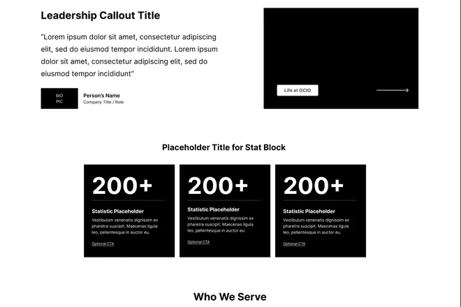
Page structure for both sites, before any visual design.
02Prototype
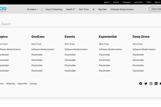
A basic Figma prototype of how someone moves through the site, starting with a topic-first menu.
03Model
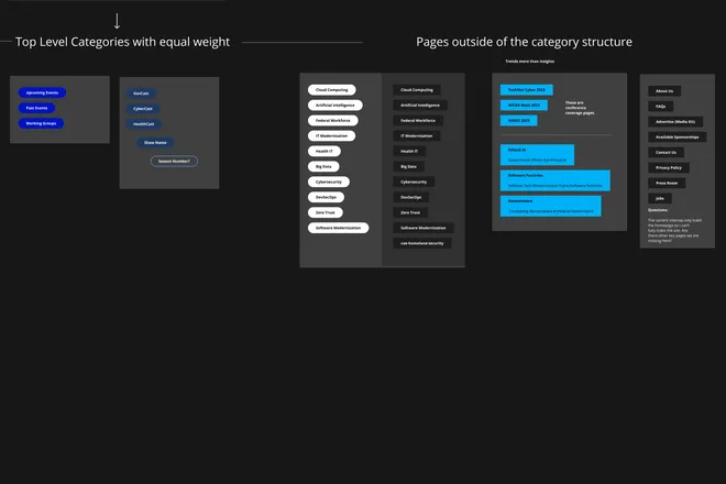
Top-level categories with equal weight, and the pages outside them, worked out with the developer.
04Redirect
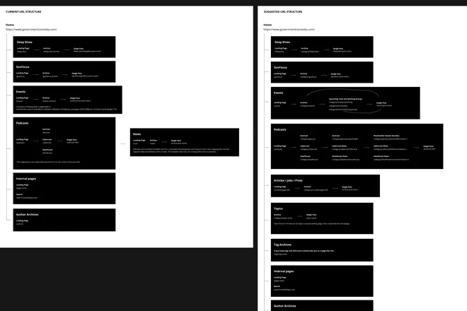
Current URLs mapped to a simpler structure, with a 301 plan and a chance to sunset old content.
What changed
More people, staying longer.
- Website visitors up 322%.
- Bounce rate down 33%, and pages per visit up 100%.
- Media & Research page speed up 65%.
- A clean URL structure with 301 redirects, and old content retired on purpose instead of left to pile up.
Numbers as reported by the client.
This was inspired by my playful pets, the stinky cheese man and, most importantly, my wonderful daughter.
curiosity and wonder is often lost in this age of technology. Sometimes you need to take chances to see new possibilities.